
Tracking Our Water Usage
Introduction
Our water service recently changed to the Consolidated Mutual Water Company CMWC, which covers a lot of the Lakewood/WheatRidge area west of Denver. Unlike our previous service, they record our water usage at hourly intervals, and give access to the data from their website. I love tracking things and collecting and analyzing data, so I was super excited to find this out. This is a quick first look at that data and patterns of our water usage. I’ll be using R for the analysis, with the packages dplyr, ggplot2, and lubridate.
Data
Data was downloaded from the website and saved as a csv file. As far as I know, there is not currently any public API that could be used to automate the data download, but I will look into this in the future. The data comes in a very clean, tidy format (unusual for data like this, kudos to CMWC!) so there isn’t too much cleaning involved.
First i’ll read in the data and look at it’s structure
dat <- read.csv('data/export.csv')
# Remove some personal info
dat <- dat %>% select(-c(Account_ID,Meter_ID,Meter_SN))
str(dat)
## 'data.frame':	1994 obs. of  9 variables:
##  $ Read_Time  : Factor w/ 1994 levels "2018-02-03 00:59",..: 1 2 3 4 5 6 7 8 9 10 ...
##  $ Timezone   : Factor w/ 1 level "US/Mountain": 1 1 1 1 1 1 1 1 1 1 ...
##  $ Read       : num  44.3 44.3 44.3 44.3 44.3 ...
##  $ Read_Unit  : Factor w/ 1 level "KGAL": 1 1 1 1 1 1 1 1 1 1 ...
##  $ Read_Method: Factor w/ 1 level "Network": 1 1 1 1 1 1 1 1 1 1 ...
##  $ Flow_Time  : Factor w/ 1994 levels "2018-02-03 00:59",..: 1 2 3 4 5 6 7 8 9 10 ...
##  $ Flow_Unit  : Factor w/ 1 level "Gallons": 1 1 1 1 1 1 1 1 1 1 ...
##  $ Flow       : num  0 2.2 0.1 0.3 0.1 0 1.4 8.3 4 3.5 ...
##  $ Register   : Factor w/ 1 level "single": 1 1 1 1 1 1 1 1 1 1 ...
The data is very clean, but I still want to make a few modifications
- Drop some columns we dont need to simplify the dataset
- Change dates from factor to datetime type
- Change some variable names
- Add weekday,weekend, and hour variables for analysis
dat <- dat %>%
  select(-c(Read_Method,Register,Read_Unit,Read,Flow_Unit)) %>%
  mutate(Read_Time=lubridate::as_datetime(Read_Time)) %>%
  mutate(Flow_Time=lubridate::as_datetime(Flow_Time)) %>%
  mutate(wkday=lubridate::wday(Read_Time,label=TRUE)) %>%
  mutate(IsWeekend = as.factor( ifelse(wkday %in% c('Sat','Sun'),1,0) ) ) %>%
  mutate(hour=lubridate::hour(Read_Time)) %>%
  rename(gallons=Flow)
#  select(-c(Read_Unit,Read,Flow_Unit))

head(dat)
##             Read_Time    Timezone           Flow_Time gallons wkday
## 1 2018-02-03 00:59:00 US/Mountain 2018-02-03 00:59:00     0.0   Sat
## 2 2018-02-03 01:59:00 US/Mountain 2018-02-03 01:59:00     2.2   Sat
## 3 2018-02-03 02:59:00 US/Mountain 2018-02-03 02:59:00     0.1   Sat
## 4 2018-02-03 03:59:00 US/Mountain 2018-02-03 03:59:00     0.3   Sat
## 5 2018-02-03 04:59:00 US/Mountain 2018-02-03 04:59:00     0.1   Sat
## 6 2018-02-03 05:59:00 US/Mountain 2018-02-03 05:59:00     0.0   Sat
##   IsWeekend hour
## 1         1    0
## 2         1    1
## 3         1    2
## 4         1    3
## 5         1    4
## 6         1    5
Ok now we’re ready to roll!
Analysis
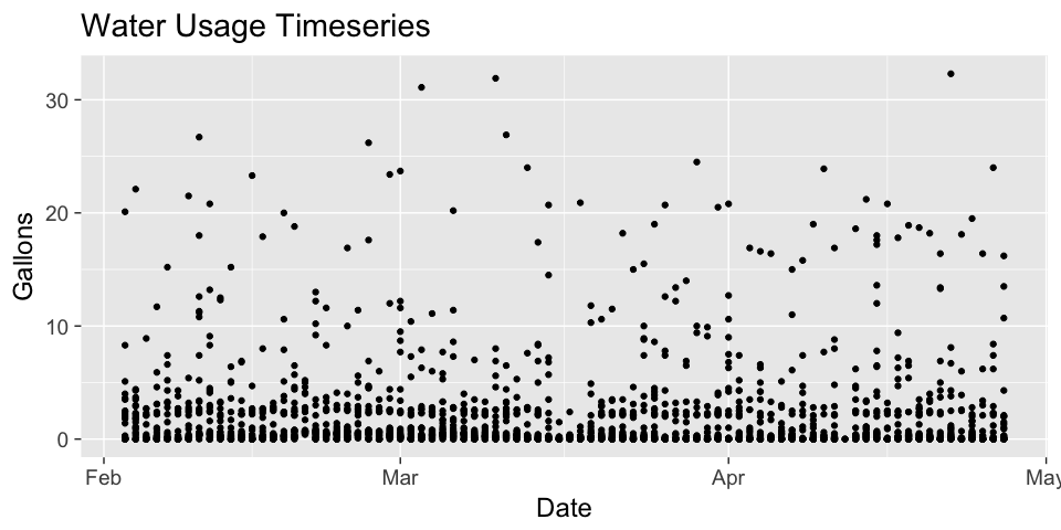
Time-series of flow
They just upgraded to recording meters, so the data only goes back to the beginning of February. There’s not too much of a pattern in time, but we can see that the values (hourly usage) are typically less than 5, with a smaller number of larger values ( maybe the dishwasher or washing machine?).
 dat %>% ggplot(aes(as.Date(Read_Time),gallons))+
   geom_point()+
   xlab("Date")+
   ylab("Gallons")+
   ggtitle("Water Usage Timeseries")
Distribution of flow values
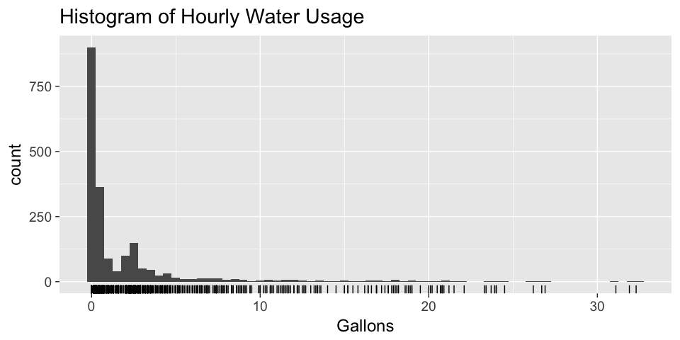
This is also shown in a histogram of the data, which shows the count of data points falling in each bin. The lines below the histogram are a rug, which show where the individual data points fall. This is useful for seeing outliers and bins with very few values, where the bars are difficult to see.
dat %>% ggplot(aes(gallons))+
  geom_histogram(binwidth = 0.5)+
  xlab("Gallons")+
  ggtitle("Histogram of Hourly Water Usage")+
  geom_rug()
Is water usage different depending on day?
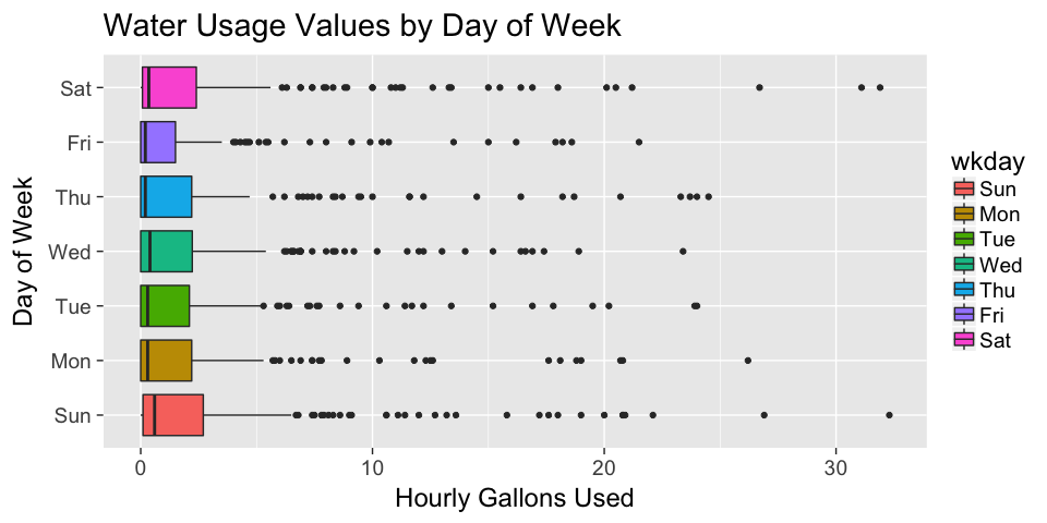
The next figure shows boxplots of hourly water usage for each day. Boxplots are a way to easily visualize statistical properties of a dataset. The box contains the middle 50% of the data points. The horizontal line in the box is the median of the dataset. Individual dots are outliers. Looking at the figure, there doesn’t seem to be much of a difference in water usage for different days.
dat %>%  ggplot(aes(wkday,gallons))+
  geom_boxplot(aes(fill=wkday))+
  xlab("Day of Week")+
  ggtitle("Water Usage Values by Day of Week")+
  ylab("Hourly Gallons Used")+
  coord_flip()
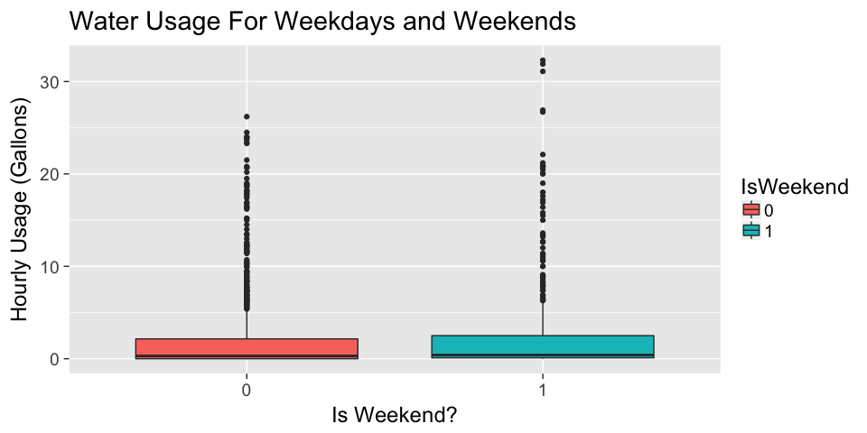
There also doesn’t seem to be too much of a difference between weekdays and weekends, as shown below. It looks like there may be some larger values on weekends than on weekdays, but it is not a large difference.
dat %>%  ggplot(aes(x=IsWeekend,y=gallons))+
  geom_boxplot(aes(fill=IsWeekend))+
  xlab("Is Weekend?")+
  ggtitle("Water Usage For Weekdays and Weekends")+
  ylab("Hourly Usage (Gallons)")
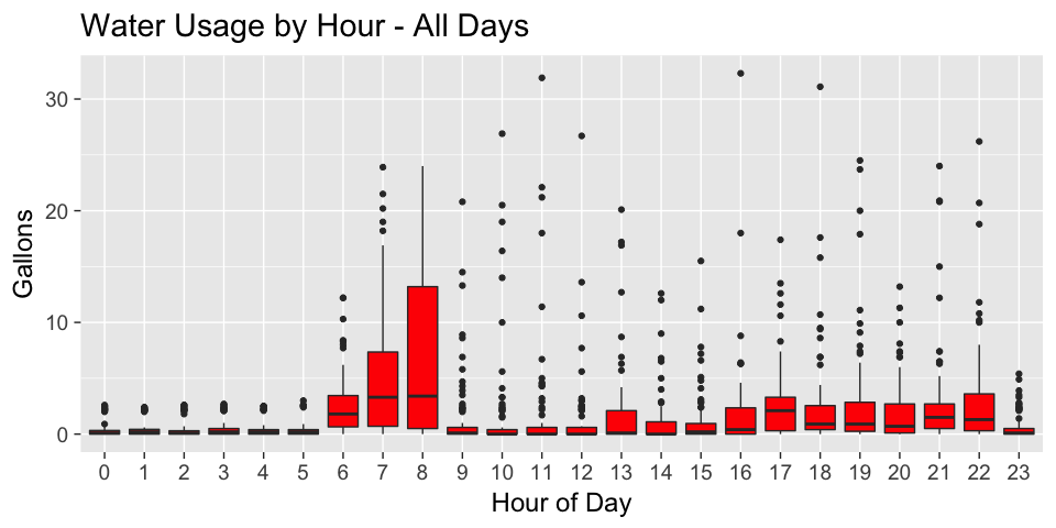
Now i’ll break it down by hour of day
The new figure shows boxplots of water usage for each hour of the day. We tend to use more water between 6 and 8 am, and from 4 to 10 pm, which is probably driven mainly by our workday schedule. The larger values in the morning are likely showers. Note that I usually leave for work by 7:30, so the larger 8:00 values are likely my wife taking a shower (you can see she takes longer showers than me :) ).
dat %>%
  ggplot(aes(as.factor(hour),gallons))+
  geom_boxplot(fill='red')+
  xlab("Hour of Day")+
  ylab("Gallons")+
  ggtitle("Water Usage by Hour - All Days")
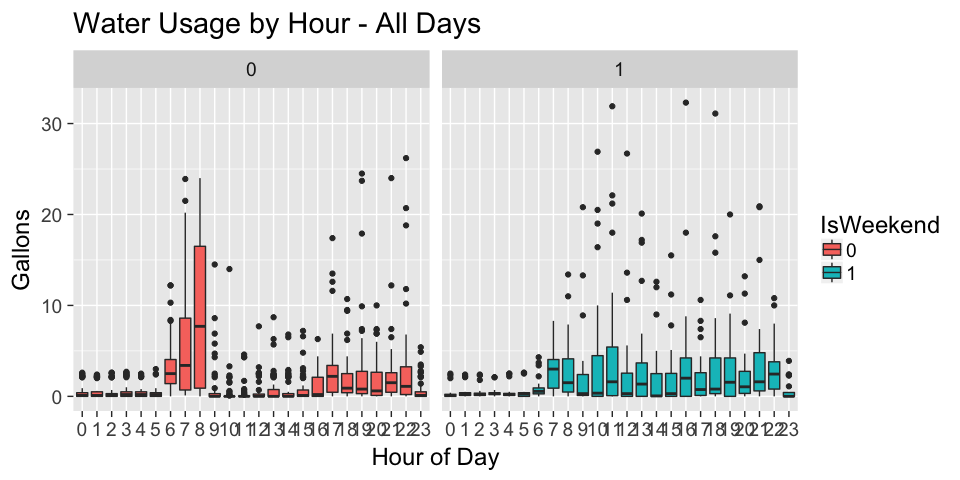
Next i’ll separate this into weekdays and weekends to see if this holds up; if the pattern is in fact due to the workday, we shouldn’t see the same pattern on the weekends.
Hourly water usage, separated by weekdays and weekends
During the week, there is a distinct pattern of more water usage in the morning and evenings which corresponds w/ the workday, as seen in the previous figure. However, on the weekends water usage is pretty evenly distributed throughout the hours we are awake.
dat %>%
  ggplot(aes(as.factor(hour),gallons))+
  geom_boxplot(aes(fill=IsWeekend))+
  facet_wrap(~IsWeekend)+
  xlab("Hour of Day")+
  ylab("Gallons")+
  ggtitle("Water Usage by Hour - All Days")
To Come
We just started being able to get our data, so we can’t look at longer-term trends like monthly or yearly yet. For example, i’d expect an increase during the summer when we are watering plants. As we get more data, we can also start seeing if our efforts to conserve water are working.